Shiji Rebranding 2025
Powering hospitality, day and night
Descr
Hospitality never sleeps, and neither do we. The theme of Day and Night represents the 24/7 nature of hospitality, one of the few global industries that operates around the clock—welcoming guests, providing comfort, and creating unforgettable experiences. This commitment to service resonates deeply with our goal of being there for hoteliers anytime, anywhere.
Day and Night is more than a metaphor—it’s a guiding principle. It shapes how we name and design our products and reflects the 24/7 support we provide to our customers. It symbolizes reliability, adaptability, and the seamless transitions that define the rhythm of hospitality.


Aligning our brand with our purpose
For over 25 years, Shiji has been a trusted name in hospitality technology. As we expand globally through acquisitions and develop new products, our original naming conventions no longer reflect the clarity and cohesion our customers require. The complexity of managing a wide portfolio of diverse products under one umbrella created challenges for both us and our clients.
With a solid foundation now in place—including the development of a unified core platform—we’re evolving into a cohesive ecosystem. This shift is more than just about renaming products; it’s about presenting Shiji as a unified brand with clear, distinct product identities. Every product now has a purpose and position within our portfolio, aligning with a single, compelling vision.
A perfect match
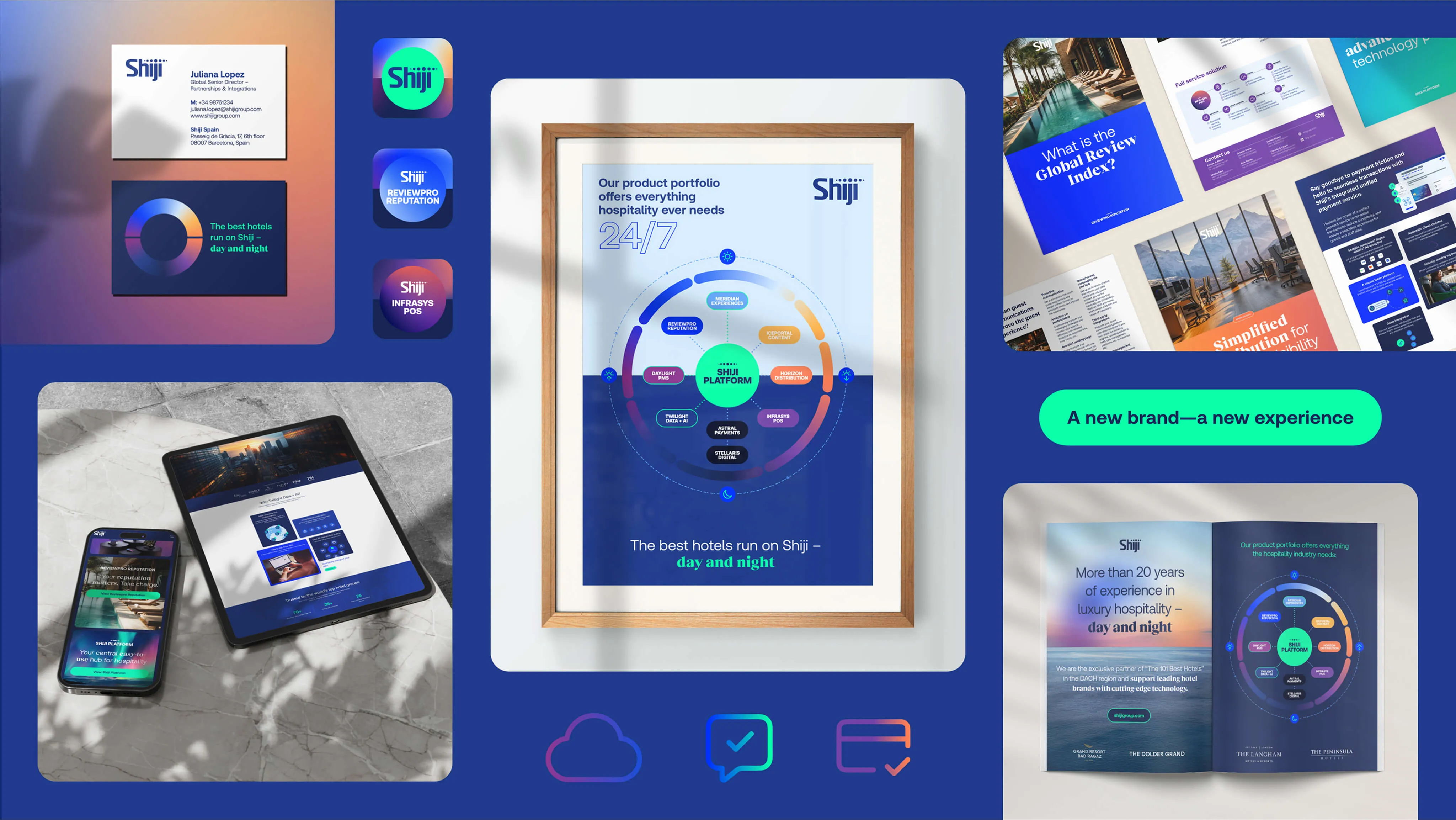
The Day and Night theme aligns every Shiji product with the natural rhythm of the 24-hour cycle. From Daylight PMS at the start of the day to Infrasys POS which supports F&B operations well into the night, each product plays a specific role in powering a hospitality business.
At the core of this cycle is Shiji Platform, connecting all products and enabling seamless integration across departments. Each product’s unique identity and design reflect its purpose and the time of day it supports, creating a cohesive system that mirrors the operations of a hotel over 24 hours. This structure helps hoteliers easily understand where each solution fits into their daily operations.
Looking towards the future
Day and Night not only captures the essence of hospitality but also sets the stage for Shiji’s vision of the future. As travel and technology evolve, we’re committed to leading the industry with innovation that empowers hotels to thrive. By creating a system that scales, we’re preparing for a future where hotels operate smarter, faster, and with greater precision—delivering exceptional experiences anytime, day or night. Shiji is proud to stand at the forefront, shaping the next chapter of hospitality technology.


The story of Day and Night is a powerful narrative central to our industry and purpose. It builds the foundation of our new Shiji design system and renamed product portfolio. Our color palette reflects the sky’s transitions from daylight to noon, sunset, midnight, and back to sunrise. This universal cycle, experienced globally every 24 hours, guides our brand design and provides a dedicated color scheme for each product. The system is designed to better tell our story and help navigate our products and services. I call it purpose-driven design.
Robert Hoffmann-Lohse,
Shiji Creative Brand Director
Bringing our brand to life
01

Design system
We built an easy-to-use, hyper-flexible design system. The Shiji Horizon helps us to horizontally or vertically organise layouts.
01

Colors
Our color palette is based on the Day-Night cycle and reflects the sky’s transitions. It helps organize our product portfolio.
01

Typography
The new font pairing aligns to the cycle and the shape-language of the Shiji logo.
01

Icons
From functional UI and illustrative icons to infographics and journey flows, the Shiji icon library is clean and easy to understand.
01
Imagery
Our imagery celebrates the stages of day and night and captures joyful moments during the guest journey that highlight the human touch.
01

Shapes
Our shape-language is based on the dot and cycle, the orthogonal layout split, bento boxes and the rounded button shape.